Did you know that the color of your logo gives a visitor a feeling about your business within seconds, even before they have read a single word? Color psychology in branding is not an afterthought. It is one of the most powerful tools you have to build trust, attract the right target audience, and set your brand apart from competitors. Yet, many Belgian entrepreneurs choose their colors based on personal taste rather than what effectively works for their industry. That is a costly mistake, and in this article, we explain exactly how to avoid it.
Table of contents
- What is color psychology in branding?
- Quick insights at a glance
- The meaning of colors in logos and websites
- Colors by industry: what works and what does not
- Comparison of color strategies
- Applying color psychology to your website
- Common mistakes in color selection
- Frequently asked questions
- References
What is color psychology in branding?
Color psychology is the study of how colors influence human emotions and behavior. Applied to branding, this means: what emotional and psychological responses does your color palette evoke in your target audience? It is not just about aesthetics. Colors drive associations, build trust, and help determine whether someone stays on your website or bounces.
Our brains process color lightning-fast and link it directly to personal experiences and cultural backgrounds. That makes color psychology nuanced, but also powerfully applicable when used deliberately. For small and medium-sized enterprises in Belgium, this is especially relevant: you have less budget for large-scale brand awareness, so every visual cue needs to hit the mark.
Quick insights at a glance
Key insight · Explanation
Color influences emotion before language — Visitors form a first impression based on color before they even read text. Make sure that impression aligns with your brand values.
Blue wins the trust game — In sectors such as finance, legal advice, and healthcare, blue consistently scores well because it radiates calm, stability, and reliability.
Red works for urgency and energy — Hospitality, retail, and sports benefit from red as a primary color. Use it sparingly on website buttons for a strong call-to-action effect.
Green signals sustainability and health — For companies in the health, food, or sustainability sector, green is the most credible choice.
Consistency strengthens recognition — Consistent use of color across all touchpoints, from logo to social media to website, builds brand recognition and reinforces trust.
Cultural context matters — In Western cultures, white stands for freshness and modernity, but it carries very different connotations in other cultures. Consider your specific market.
Color and conversion are linked — The color of your call-to-action button, your hero section, and your trust badges help determine whether a visitor converts into a lead or customer.
The meaning of colors in logos and websites
Every color carries a set of associations. That set is not arbitrary. It has been built up through years of cultural exposure, brand positioning by major players, and evolutionary reflexes. When designing a logo or website, it is essential to understand what each color communicates before making a final choice.
The seven most commonly used brand colors and their meanings
Based on common insights in color psychology and branding, we see the following patterns emerge in logo design and brand identity:
- Red: Passion, urgency, energy, and excitement. Grabs attention and prompts action.
- Blue: Trust, stability, calm, and reliability. The most popular choice in B2B sectors.
- Yellow: Optimism, cheerfulness, warmth, and creativity. Works well as an accent color, rarely as a primary color.
- Green: Growth, health, freshness, and sustainability. Strong in industries closely tied to nature or well-being.
- Purple: Luxury, ambition, wisdom, and exclusivity. Used by premium brands and creative agencies.
- Black: Power, elegance, professionalism, and modernity. Timeless and versatile as a foundation.
- Orange: Youthfulness, enthusiasm, and accessibility. Popular with startups and friendly consumer brands.
The choice always depends on your target audience and brand positioning. Red and orange generally attract a younger, more energetic audience. Blue and green are more likely to appeal to a serious, professional audience.
Color is not merely a visual decision. It is a branding decision that determines who trusts you, who remembers you, and who buys from you.
Warm versus cool colors in visual design
Warm colors like red, orange, and yellow create a sense of closeness, energy, and urgency. They are suitable for page elements that require immediate action, such as buttons and promotional banners.
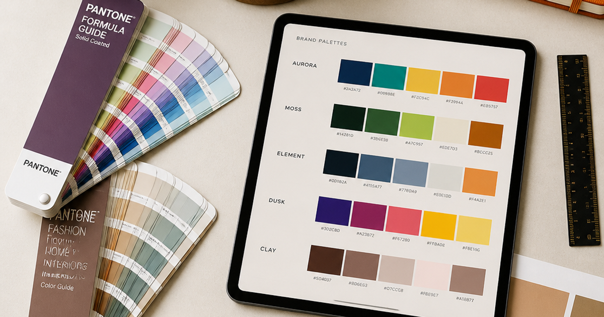
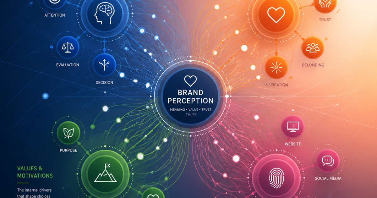
Cool colors like blue, green, and purple radiate calm and invite trust and reflection. They work well as a background or as a primary brand color when your credibility is central. For visual design marketing: combine both worlds thoughtfully so that you both capture attention and inspire trust.
Colors by industry: what works and what does not
There is no universal "best color for a logo". What does exist, however, is a color that optimally aligns with the expectations and emotions of your specific target audience. Here, we walk through industry by industry.
Financial services and legal advice
Blue dominates this industry, and that is no coincidence. Clients who entrust their money or legal matters to a firm seek trust and stability above all else. Dark blue and navy blue are the most effective choices for this. Black as an accent color adds professionalism.
Avoid bright colors such as red or orange as a primary color. They signal urgency and risk, exactly the feelings you want to avoid in this sector.
Health, wellness, and care
Green and light blue are the dominant colors here. Green evokes associations with health, freshness, and nature. Light blue radiates calm and safety. White as a background reinforces the feeling of hygiene and clarity.
A common mistake in this industry is using too many dark colors, making the page feel heavy and closed off, whereas patients and clients are actually looking for openness and warmth.
Hospitality, food, and retail
Red stimulates appetite and urgency. That is why many fast-food chains use red prominently. Orange combines energy with accessibility and works strongly for friendly concepts. Yellow evokes cheerfulness and works well as an accent color in food branding.
For fine dining restaurants, a different rule applies: dark shades such as black, deep blue, and burgundy communicate exclusivity and sophistication, whereas bright colors tend to define casual eateries.
Technology and software
Blue is the standard in tech, simply because it radiates trust and reliability. But more and more tech companies are choosing purple and black to stand out and build an innovative, premium image. White as a base color and minimal color accents suit brands that focus on simplicity and ease of use.
Creative agencies and marketing firms
This is the sector with room for the most freedom. Purple, orange, and bold color combinations work well because they express creativity and originality. At the same time, this applies even more strongly: make sure your color palette is coherent and does not come across as chaotic. A creative agency that lacks control over its own visual identity will not convince clients of its design capabilities.
Tip: Look at how your direct competitors use color and consciously choose differentiation. If everyone in your sector uses blue, a strategic choice for another color can make you immediately recognizable, provided that color also aligns with your brand values.
Comparison of color strategies
Not every approach to color usage in branding works equally well. Below, we compare three commonly used strategies so you can make an informed choice for your brand.
Strategy · Advantages · Disadvantages and pitfalls
Monochrome color palette (one primary color + shades) — Strong, consistent brand identity, easily recognizable, calm, and professional — Can feel boring or monotonous without good variation in shades. Less suitable for industries wanting to project diversity and creativity.
Complementary colors (two colors opposite each other on the color wheel) — High visual tension and attention, ideal for call-to-action elements and energetic brands — Risk of visual sensory overload if both colors are used equally dominantly. Requires disciplined design.
Analogous color palette (two to three colors adjacent to each other on the color wheel) — Harmonious and pleasing to the eye, works well for brands seeking to radiate calm, trust, and professionalism — Less contrast between elements, making call-to-action buttons stand out less. Requires strong typographic hierarchy as compensation.
Applying color psychology to your website
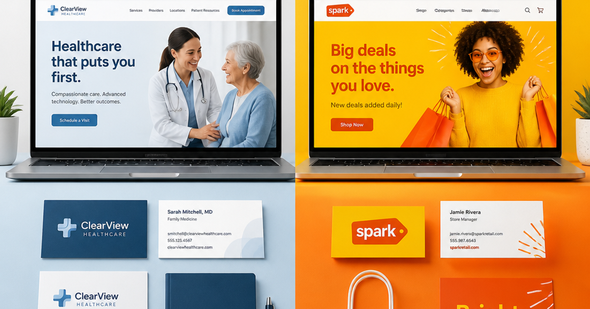
A logo is the concentration of your brand color, but your website is the canvas on which that color influences thousands of visitors daily. Logo and website colors must be in perfect harmony, but on a website, they serve different functions than in a logo.
Building hierarchy with color
Use your primary brand color for the elements you want visitors to notice first: your logo, your main navigation, and your call-to-action button. Use your secondary color for supporting elements like subheadings, icons, and dividers. Neutral colors like white, light gray, or beige fill the background and give the page room to breathe.
A common mistake is using your brand color as the background color for large text blocks. This strains the eyes and drastically reduces readability. Brand color as a background only works for hero sections and call-to-action blocks where you place short, punchy messages.
The color of your call-to-action button
Your call-to-action button must contrast with the rest of your page. If your website is predominantly blue, orange or yellow works well as a button color. If your website is predominantly white, your primary brand color works excellently as a button color. It is not about which color is "the best" in abstract terms, but which color stands out the most on your specific page.
Tip: Always test two variants of your call-to-action button color via a simple A/B test before making a final decision. Small color differences can make a noticeable difference in the number of clicks and contact requests you receive.
Consistency across all channels
Consistency in color usage is the backbone of brand recognition. When you use the exact same colors on your website, social media, quotes, and email signatures, your brand is recognized faster and more strongly. That trust ultimately translates into more leads and more customers. At Iconic Creative Agency, that is precisely why we develop a full brand identity for every project, including a color palette with exact HEX and RGB values, ensuring consistent color usage across all channels.
Common mistakes in color selection
In practice, we repeatedly see the same mistakes emerging among small and medium-sized enterprises in Belgium. They are avoidable, but they certainly cost customers and trust.
Choosing color based on personal preference
"I like green, so my logo will be green." That is the starting point of many color choices, and it is the wrong starting point. The question is not which color you like, but which color appeals to your target audience and which color fits the emotions your brand wants to convey.
An accounting firm that chooses purple because the owner likes purple misses an opportunity to instantly signal trust. Conversely, a creative agency that automatically chooses blue might get lost in the crowd. Let strategy drive color selection, not personal taste.
Using too many colors
A logo or website with five or more colors looks chaotic and unprofessional. It also dilutes brand identity. A strong brand works with a maximum of two to three colors used in a clear hierarchy. More is rarely better in visual design.
Ignoring accessibility
Color contrast is not just an aesthetic choice; it is also a matter of accessibility. If text and background have insufficient contrast, your content is unreadable for people with visual impairments. That is not only an ethical problem, it also hurts your search engine optimization and conversion rates.
Tip: Use a free tool like the WebAIM Contrast Checker to verify whether your color combinations meet WCAG accessibility guidelines before your website goes live.
Not aligning color usage with the industry
A law firm with a fuchsia pink website sends the wrong signals, no matter how good the design is. Conversely, a daycare center with a cold dark blue website lacks the warmth and accessibility that parents expect. Industry-specific color conventions are not constraints; they are signals you can leverage smartly or deliberately break if you have a sound reason to do so.
Frequently asked questions
How do I choose the right color for my logo?
Do not start with your personal preference, but with your target audience and brand values. Ask yourself: what emotions do I want to evoke? What feeling should my brand radiate? Next, look at the color psychology that fits those emotions and check how competitors use color. Differentiation is an added consideration, but it must never come at the expense of credibility in your industry.
Must my website color be exactly the same as my logo color?
Your primary brand color should match on both, but on a website, you use that color within a broader hierarchy. Your logo displays the brand color in concentrated form. Your website uses that color strategically for specific elements such as buttons, headers, and accents, with neutral colors as a base. The color values in HEX or RGB must be identical across all channels.
Does color really influence conversions on my website?
Yes. The color of your call-to-action button, the color of your background, and the color contrasts on your page influence how visitors navigate and whether they take action. There is no magical "conversion color", but the principles of contrast, hierarchy, and consistency have a direct, measurable effect on visitor behavior.
Are color associations in Belgium and the Netherlands the same as in other countries?
For the most part, yes, but there are nuances. Western color associations are largely shared, but some colors carry very different meanings in other cultures. If you operate exclusively in the Belgian or Dutch market, standard Western color associations are a reliable basis. If you target international markets, additional research into cultural color conventions is sensible.
Can I change my brand colors later on?
Technically yes, but it comes at a cost. A rebranding with new colors requires a consistent rollout across all channels and materials. Moreover, you lose part of the accumulated brand recognition. It is better to make a well-thought-out color choice from the start than to correct it afterwards. Invest in a solid brand identity before having logos and websites designed.
How do I know if my color choice is working well?
Test it. Ask for feedback from people in your target audience, not from friends and family who just want to please you. Observe the initial feeling people describe when seeing your website or logo. Does that feeling align with the values you want to project? If so, you are on the right track. If not, adjustments are necessary before investing further in marketing.
Which color do you use for your brand, and does that choice match what your customers expect from you? Let us know in the comments or send us a message—we are curious about your experience.
References
- In-depth explanation of color psychology applied to logo design
- How color usage influences brand identity for businesses in the Netherlands and Belgium
- What experts say about the psychology behind color usage in branding
- What color psychology reveals about logos and brand perception
- The psychology of color in branding and design: building brand identity