Most startup landing pages fail before a visitor even reads the headline. The layout is confused, the value proposition is buried, and the call to action asks for too much too soon. If your page is pulling a conversion rate below 5%, the problem is almost never your product. It is your page structure. This guide breaks down the exact anatomy of a high-converting landing page, section by section, with real startup examples and the reasoning behind every decision. Follow these startup landing page best practices and you will know precisely what to fix and why.
Table of Contents
- Quick Takeaways
- Why Most Startup Landing Pages Fail
- The Hero Section: Your One Shot at a First Impression
- Value Proposition and Benefits: Clarity Over Cleverness
- Social Proof That Actually Works
- CTA Design and Placement: Where Conversions Live or Die
- Landing Page Copy Frameworks for Startups
- Real Examples Breakdown: What Stripe, Notion, and Slack Do Right
- Approach Comparison: Three Landing Page Styles
- Frequently Asked Questions
- References
Quick Takeaways
Key Insight · Explanation
The hero section is your most important real estate — Visitors decide within seconds whether to stay or leave. Your headline, subheadline, and primary CTA must all appear above the fold with no competing distractions.
The cross-industry median conversion rate is 6.6% — According to Unbounce's 2024 Conversion Benchmark Report analyzing over 57 million conversions, most pages sit at 6.6%. Top pages hit 11% or higher, proving structure and copy drive massive gains.
A single focused CTA outperforms multiple CTAs — Reducing the number of CTAs to one primary action has been shown to dramatically increase conversions. Every extra option you give a visitor is a reason to delay deciding.
Social proof belongs near the top, not the bottom — Customer testimonials and trust signals placed near the hero section accelerate trust before visitors decide to scroll deeper.
Message match between your ad and your landing page is non-negotiable — If your paid ad promises one thing and your landing page opens with something different, visitors leave immediately. Consistency between traffic source and page copy is a basic requirement.
Mobile accounts for over 80% of landing page visits — Unbounce's 2024 data puts mobile traffic at 83% of all landing page visits. A desktop-first design approach is building for the minority.
Specificity in testimonials beats generic praise — A testimonial that names a real result ("We cut our onboarding time by 40%") converts far better than "Great product, highly recommend." Specific outcomes build credibility; vague praise does not.
Why Most Startup Landing Pages Fail
The most common mistake founders make is treating their landing page like a product brochure. They list every feature, explain the full backstory, and write copy that impresses them rather than communicates to a visitor who arrived with a problem to solve. A landing page is not a brochure. It is a decision environment built for one specific action.
The second most common mistake is confusion about the audience. Early-stage startups frequently write for themselves, using internal jargon, assuming product knowledge that visitors do not have, and leading with the solution before establishing that they understand the problem. A visitor who does not feel understood does not convert.
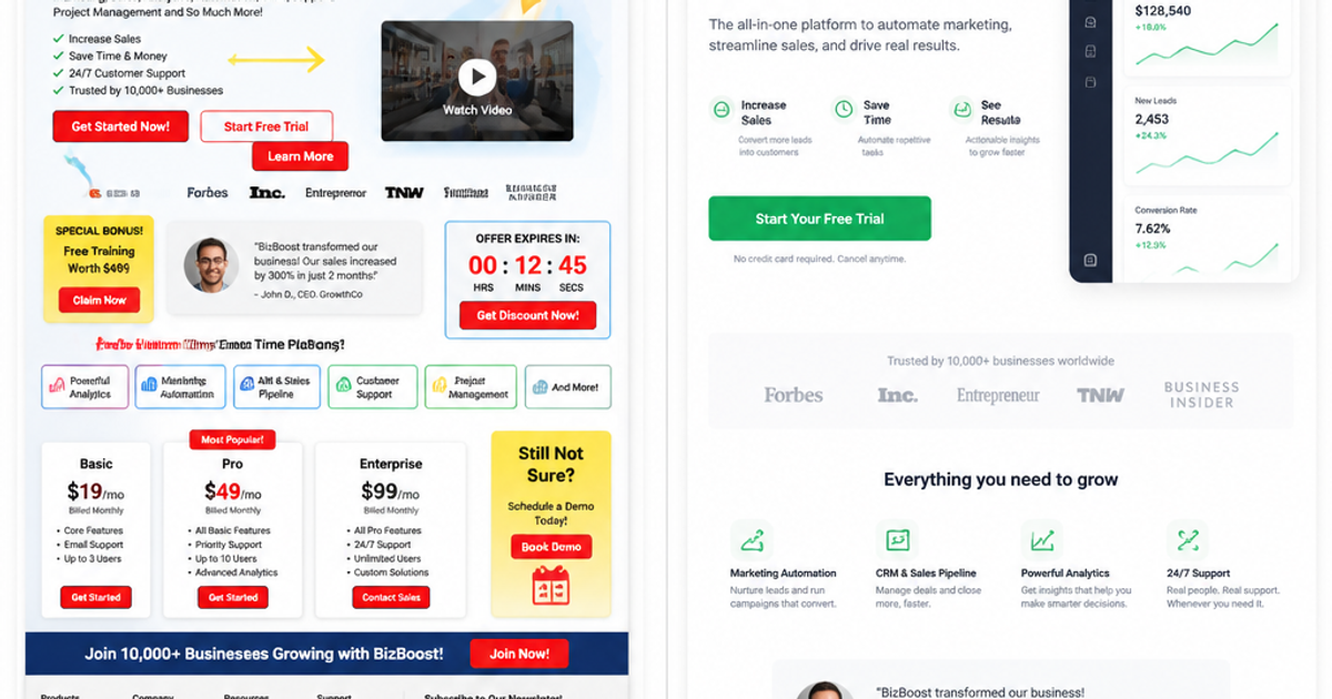
There is also a structural problem. Many startup landing pages are essentially homepages with navigation menus, multiple CTAs pointing to different destinations, blog links, and footer menus. Each one of those links is an exit ramp away from conversion. Landing pages built for conversion strip away navigation and focus the entire page on a single goal.
The Hero Section: Your One Shot at a First Impression
The hero section is the area a visitor sees before they scroll. Everything that matters about your product needs to be communicated here in under five seconds. That is not an exaggeration. It is what the data consistently shows about visitor attention windows on landing pages.
The Headline
Your headline has one job: make the visitor want to keep reading. It does this by stating clearly what your product does and for whom. The structure that works most reliably is outcome-based: what will the visitor be able to do, or what problem will they no longer have, after using your product. "Payments infrastructure for the internet" (Stripe) works because it is specific and unforgettable. "The everything app" tells you nothing useful.
A common mistake is writing a clever or poetic headline that sacrifices clarity for originality. Clarity always wins on a landing page. Your headline is not the place to show off your brand voice. It is the place to answer the visitor's first question: "Is this for me?"
The Subheadline
The subheadline expands on the headline. If your headline is the promise, the subheadline is the mechanism: how you deliver that promise. Keep it to two sentences maximum. The visitor should finish reading the hero section knowing what the product is, who it is for, and what happens when they click the primary button.
The Hero Visual
Every image in the hero section should demonstrate the product in action, not decorate the page. A screenshot of your dashboard, an animation showing the core workflow, or a before-and-after comparison all perform better than abstract photography of people looking inspired at laptops. Images on landing pages should work, not sit there looking pretty. A hero visual that shows the product builds immediate product comprehension and reduces the cognitive load on the visitor.
Pro tip: If you cannot describe in one sentence what your hero image communicates about your product, replace it. Abstract visuals are a conversion liability.
Value Proposition and Benefits: Clarity Over Cleverness
Your value proposition is not your list of features. It is the answer to the question every visitor is silently asking: "Why should I choose this over everything else available to me?" Most startup landing pages confuse features with benefits, and this distinction is where conversions are lost or won.
A feature is what your product does. A benefit is what the visitor gets because of that feature. "Automated invoice reconciliation" is a feature. "Close your books in hours instead of days" is a benefit. Write your landing page in benefits language, and then support each benefit with the feature that delivers it.
How to Structure the Benefits Section
The most effective benefits sections on startup landing pages present three to four core outcomes, each supported by a short explanation and an icon or visual. More than five benefits in a row starts to read like a feature list rather than a value statement. Each benefit block should connect directly to a pain point your target audience already knows they have. If you are marketing to startup founders, "reduce time wasted on manual reporting" lands harder than "powerful analytics dashboard."
The ordering matters. Lead with the benefit that solves the most acute pain. Visitors who see their biggest problem addressed first are far more likely to keep reading. The benefits section is also where you can introduce proof points: a number, a customer result, or a case study reference that validates the claim you are making.
Pro tip: Write your benefits section after spending an hour reading customer reviews of your competitors on G2 or Capterra. The exact phrases customers use to describe their problems are the phrases that belong in your copy, not the language your engineering team uses internally.
Social Proof That Actually Works
Social proof is not optional on a startup landing page. It is functional psychology. A visitor who has never heard of your company is making a trust decision before they make a product decision. Social proof accelerates trust, and trust accelerates conversion.
According to data on trust signals and conversion, customer testimonials increase conversions by 34%, yet a significant portion of marketers still do not include them on landing pages. The gap between what is known about social proof and what most pages actually implement is one of the most persistent inefficiencies in startup marketing.
What Social Proof to Use and Where
The most effective types of social proof for startup landing pages, ordered by impact, are: specific outcome-based testimonials from identifiable customers, logos of recognizable companies using your product, aggregate statistics (number of users, revenue processed, time saved), and third-party review scores from platforms with authority in your space.
Placement matters as much as content. Positioning social proof close to your primary CTA, rather than at the bottom of the page, removes doubt at the moment of decision. A row of recognizable company logos placed just below the hero section communicates immediately that real businesses have vetted this product. For early-stage startups without big-name customers, specific individual testimonials with a name, photo, and company title outperform anonymous or initials-only reviews every time.
A landing page without social proof is asking visitors to trust you on your word alone. In a world where every startup claims to solve every problem, independent validation is the difference between a page that converts and one that informs and exits.
The Specific Testimonial Formula
Generic testimonials do not convert. "Great tool, would recommend" is noise. The testimonials that move conversion metrics follow a simple formula: situation before, action taken, specific measurable outcome. "Before switching to [product], our team spent three hours a week on manual data entry. Now it takes ten minutes" is a testimonial that sells. Collect testimonials with this structure in mind, and if you need to edit for length, keep the specific numbers and cut the adjectives.
CTA Design and Placement: Where Conversions Live or Die
The call to action is the single most measurable element on a landing page, which makes it both the most tested and the most frequently mishandled. The goal of every section above the CTA is to make clicking it feel like the logical next step rather than a commitment.
CTA Copy That Converts
The worst CTA copy on startup landing pages shares one characteristic: it is written from the company's perspective rather than the visitor's. "Submit," "Get Started," and "Sign Up" tell the visitor what they are doing for you. "Start your free trial," "See how it works," and "Get my dashboard" tell the visitor what they are getting. The reframe from company-centric to visitor-centric copy is small in character count and significant in conversion impact.
Personalized CTAs, where the button text reflects the visitor's specific context or goal, consistently outperform generic alternatives. The principle is simple: the more your CTA matches the specific desire the visitor arrived with, the lower the psychological friction of clicking it.
CTA Placement
Your primary CTA must appear above the fold. Data shows that CTAs placed above the fold significantly outperform those placed only at the bottom of the page. On a long-form landing page, repeat the CTA at logical decision points: after the value proposition, after the social proof section, and at the end of the page. But keep a single primary action. A page that offers a free trial, a demo booking, a newsletter signup, and a contact form is asking visitors to decide between four things instead of one. That is not user-friendliness. That is conversion dilution.
Landing Page Copy Frameworks for Startups
Writing landing page copy from scratch with no framework produces rambling, unfocused pages. Two frameworks work consistently well for startups at different stages.
PAS: Problem, Agitate, Solution
PAS is the most reliable framework for early-stage startups marketing to an audience that already knows they have a problem but has not found the right solution. Start by naming the problem precisely. Then describe the real cost of that problem: the time lost, the revenue missed, the team frustration, the opportunity cost. Then introduce your product as the solution. This structure works because it leads with empathy before it leads with product, and empathy is what earns the attention needed to make the product case.
BAB: Before, After, Bridge
BAB works well when your product produces a dramatic contrast in outcomes. Describe the visitor's current situation (before), describe what their world looks like after using your product (after), and then introduce your product as the bridge between those two states. This framework is particularly effective for productivity tools, automation products, and platforms where the time-before-versus-time-after contrast is stark and demonstrable.
The One-Page Audit Before You Launch
Before any startup landing page goes live, read it top to bottom and answer three questions. Does the headline tell a new visitor exactly what this is in under five seconds? Is there exactly one primary action being requested? Does the page answer the unspoken question "why should I trust this?" with evidence rather than assertion? If any answer is no, the page is not ready.
Real Examples Breakdown: What Stripe, Notion, and Slack Do Right
Looking at what funded, high-growth startups actually do on their landing pages is more instructive than any list of abstract principles. Three examples consistently come up in conversion discussions because they execute the fundamentals exceptionally well.
Stripe: Extreme Clarity at Scale
Stripe's landing pages are studied because they prove that a complex, technical product does not require a complex, technical landing page. The value proposition sits prominently above the fold, the visual hierarchy is clean, and trust indicators are placed to build credibility immediately. The copy speaks to the developer and the business owner simultaneously without trying to be everything to everyone. Stripe does not try to explain every API feature on the landing page. It explains the outcome: payments infrastructure that just works, at any scale.
Notion: Product as the Proof
Notion's landing page demonstrates a different principle: show the product working, not a description of the product. Their hero section uses the actual product interface to communicate what the tool does, which eliminates the comprehension gap that abstract screenshots create. Notion also uses a minimal, distraction-free design that keeps the visitor's attention on the primary action. The single-page structure creates a natural flow that guides visitors through different product benefits without requiring navigation decisions.
Slack: Benefits Before Features
Slack's conversion-focused pages consistently lead with the human outcome rather than the feature set. The problem Slack addresses, fragmented team communication and lost information, is one that every knowledge worker already feels. By naming that problem and showing a clear before-and-after, the product case is made before a single feature is listed. This is the PAS framework applied by a company with extensive resources and consistent conversion data behind their choices.
Approach Comparison: Three Landing Page Styles
Approach · Best For · Key Strengths and Weaknesses
Short-form landing page (one screen) — Paid ad traffic, single-offer campaigns, email signups — Strengths: fast to load, zero distraction, forces messaging discipline. Weaknesses: insufficient for complex products that require education before conversion. Works when visitors arrive already informed.
Long-form landing page (multi-section scroll) — SaaS demos, high-consideration purchases, B2B tools — Strengths: handles objections, builds comprehensive trust, caters to different visitor intent levels. Weaknesses: requires strong copy throughout or visitors drop off mid-page. Needs multiple CTA placements to capture ready-to-convert visitors early.
Conversational or quiz-based landing page — Personalized recommendations, segmented funnels, coaching and service businesses — Strengths: high engagement, collects qualification data, delivers personalized outcomes that increase relevance. Weaknesses: higher development complexity, can feel gimmicky if the product does not genuinely benefit from personalization. Requires strong question logic to avoid drop-off mid-flow.
Frequently Asked Questions
What is a good conversion rate for a startup landing page?
The cross-industry median landing page conversion rate is 6.6%, based on Unbounce's 2024 Conversion Benchmark Report covering over 41,000 landing pages. For SaaS specifically, the median runs closer to 3.8%. A well-optimized startup landing page with focused copy, a single CTA, and solid social proof should target 8 to 12 percent. Hitting that range consistently requires ongoing A/B testing, not a one-time build.
How long should a startup landing page be?
Length should match the complexity of the decision you are asking visitors to make. A low-friction action like joining an email waitlist can convert from a short one-screen page. A B2B SaaS demo request, where the visitor is committing team time and budget consideration, needs enough content to handle objections and establish trust before asking for that commitment. The rule is simple: long enough to answer every objection, short enough to lose no one who is ready to act.
Should a startup landing page include navigation?
No. Navigation on a landing page is a set of exit ramps. Every link that takes a visitor away from the page before converting is conversion leakage. For dedicated campaign landing pages, remove the top navigation entirely. The only links on the page should be the primary CTA and, if necessary, a minimal footer with legal links. Your homepage can have full navigation. Your landing pages should not.
How many CTAs should a startup landing page have?
One primary action. You can repeat that same CTA button multiple times down a long-form page, but it should always point to the same conversion goal. Secondary actions like "learn more" or "watch a demo" should be visually subordinate and never compete with the primary button in size, color, or placement. The moment you give visitors two equally prominent choices, you have introduced decision paralysis that directly reduces conversion rates.
What social proof works best for early-stage startups with few customers?
Specific, outcome-based testimonials from even a handful of real customers outperform generic endorsements from a long list of anonymous users. If you have five customers with strong results, get those five results written up properly with names, photos, and specific numbers. That is more persuasive than fifty vague five-star ratings. You can also use press mentions, inclusion in accelerator programs, or notable investors as credibility signals when customer volume is still limited.
Does page load speed actually affect landing page conversions?
Yes, and the effect is larger than most founders realize. Slow load times increase bounce rates before a single word of your copy is read. On mobile, where over 80% of landing page traffic now arrives, even a two-second delay is enough to push visitors away. Page speed is a structural conversion factor, not an aesthetic one. Compress images, minimize scripts, and prioritize above-the-fold load time as core elements of landing page performance, not afterthoughts.
How should startups A/B test their landing pages?
Start with the elements that have the highest impact on visitor decisions: headline copy, CTA button text and color, and hero visual. Test one variable at a time with enough traffic to reach statistical significance before drawing conclusions. A common mistake is running too many tests simultaneously or switching variables before collecting enough data. If you are running paid traffic to a landing page, set up the first A/B test on the same day you launch. Waiting weeks to optimize a page that is already spending budget is one of the most expensive habits in startup marketing.
What does your startup landing page currently do well, and where do you think it is losing visitors? Share your experience in the comments below.
References
- Unbounce guide to landing page best practices covering mobile optimization, message match, and conversion benchmarks from the 2024 Conversion Benchmark Report
- FormAssembly breakdown of high-converting landing page traits and industry conversion rate data from Unbounce's analysis of 57 million conversions
- Julian Shapiro's detailed startup landing page guide covering hero section structure, CTA strategy, and copy principles for early-stage companies
- SeedProd reference on landing page conversion rate benchmarks by industry and traffic source, including SaaS and paid ad averages
- Flint's compilation of trust signal and social proof conversion statistics, including testimonial and trust badge impact data